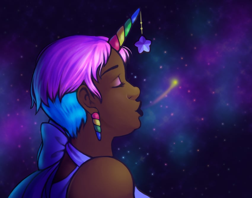
1. How to Start the Initial Sketch
Step 1
Let’s start by Creating a New Document. I chose to work with a document that is 11 inches tall by 14 inches wide, at a resolution of 300 dpi.

Step 2
Create the initial sketch on a New Layer—you can do so by clicking on the Create a New Layer icon in the Layers panel.

Step 3
I like to sketch using a Hard Round Brush, with the Opacity Jitter and Flow Jitter set to Pen Pressure. This means that the amount of pressure I put on my pen will affect the Opacity and Flow of my Brush Strokes.

Step 4
Once I’m happy with my initial concept, I will often draw on top of my work, on a New Layer, when creating a more refined sketch. This can be achieved by creating a New Layer on top of your artwork. Then, you can lower the Opacity on your previous artwork Layer, leaving it only partially visible.

2. How to Add Initial Colors
Step 1
First, make sure to either hide or delete the initial sketch—this can be achieved by either Toggling Visibility Off or Deleting the Layer via the “trash can” icon. If you haven’t saved yet, this is a great time to do so! I like to save a backup, as I frequently flatten my layers.
Then, Create a New Layer on top of the refined sketch. Set this layer’s Blending Mode to Multiply. I like to place color on top of my lines, via this method. I like to work this way because it adds additional value to my lines, as shown below.

Advertisement
Step 2
Sometimes, I like to place individual colors on their own layer, utilizing Clipping Masks. I particularly like to do this when I’m not quite sure what colors I’d like to use yet, or when it’s a composition where I know there will be a lot of variation.
To do so, I continue coloring on my original color layer, with the Blending Mode set to Multiply (same as Step 1). Fill the entire area of the artwork with a base color of your choice.
Then, Create New Layers and set them as Clipping Masks. To do so, right click on the Layer and select Clipping Mask.
Why Clipping Masks? Well, you’ll notice that you won’t be able to color outside of the base color we’ve added here. It means no worrying about coloring outside of this defined shape.

Step 3
To demonstrate one of the ways this could come in handy, let’s change the color of the character’s hair. Maybe I’m not too keen on yellow—maybe pink or blue would look better. I could select colors by hand and fill that area in, but instead, let’s adjust the Hue and Saturation.
First, select the layer containing the color at the top of the hair. Then select Image > Adjustments > Hue/Saturation. This will open the Hue/Saturation window.
Make sure that Preview is Toggled On. Then, adjust the three values—Hue, Saturation, and Lightness—to experiment with the color of this part of the illustration. Personally, I find this to be a quick way to preview different colors and values, to see what I might like best!

Step 4
Once I’m happy with my selections, I typically Flatten my artwork Layers (still leaving the Background independent).
Let’s add a background color using the Paint Bucket Tool. I chose a dark, cool color, because I’d like to set this character against a dark sky. Apply this color to the Background Layer.

Step 5
However, I think my color choices here could have a stronger relationship to my background color. So I’m going to use Blending Modes to make these colors look a little cooler.
Create a New Layer on top of the artwork and apply a Clipping Mask. Using a dark, saturated, cool color, Fill the Layer using the Paint Bucket Tool. You’ll notice that the color is only visible in the artwork—thanks to our Clipping Mask!
Set this Layer’s Blending Mode to Linear Dodge (Add) to add a tint of color to our work. I lowered the Opacity on this layer to 75%, to make it less intense.
Check out the difference for yourself!

Step 6
Before we start rendering the character, let’s put down some initial values. At this step, I like to think about where my light source is and how it might affect the subject.
In this case, I wanted the light to be in front of the character’s face.
Create a New Layer and set it as a Clipping Mask. The Blending Mode should be set to Multiply. Then, using both a Hard Round Brush and Soft Round Brush, paint in values using a light purple color.

3. How to Create the Background
Step 1
Let’s start working on our background. First, Create a New Layer between the artwork and background layers. This is where we’re going to draw our stars.
Using a Hard Round Brush, draw small dots. I like to draw them in little clusters, rather than in a set pattern, so they look more organic in the sky. I drew my dots in a light, cyan color.

Step 2
At this point, our stars just look like little dots. Let’s use the Filter, Gaussian Blur, to give them a bit of a glow-like haze. I set my Gaussian Blur to 15 pixels (for reference, you can find this Filter via Filters > Blur > Gaussian Blur).
Then, to make the stars more colorful, I created a New Layer on top of them. Make this New Layer a Clipping Mask.
Use a Soft Round Brush to add varied colors to the stars. I chose saturated pinks and yellows, sprinkling the color variation around in the sky.

Step 3
Let’s add additional colors to the sky, overall.
Create a New Layer, above the stars, and set the Blending Mode to Soft Light. Using a Soft Round Brush, add a strip of light pink to the sky. Be careful not to make the line look “too perfect”.
To add color variation to this area, create an additional New Layer. Leave the Blending Mode on this one set to Normal. Using a Soft Round Brush, I dabbed in light blues and purples.

Step 4
Let’s create yet another New Layer. We’re going to add some texture to our starry background, so the color variation looks more like clouds.
Make sure your Foreground and Background Colors are set to black and white. Then, with your New Layer selected, apply the Cloud Filter by going to Filters > Cloud.
This will result in a smoky, cloud-like pattern, as seen below.

Step 5
Take the Layer where the Cloud Filter was applied and turn the Blending Mode to Color Dodge. You’ll notice that, now, this smoky pattern adds a cloud-like effect to our sky.
In addition, I wanted to tone down some of the stars. On a New Layer, above the stars, I took a Soft Round Brush and added some darker values. Now, some of the stars, particularly around the edges of the composition, look more faded into the background.

Step 6
Since the light source is in front of the character, I thought it would be fun to add a shooting star here, as a point of interest.
Use a Soft Round Brush to create a curved line in the sky area. Then, use a Soft Round Eraser to soften the edges and make it fade into the background, around the tail area.
Once I was happy with the shape of the shooting star, I Locked Transparent Pixels on this layer, so I could add color variations—like the pinks and purples in the tail.

4. How to Paint the Character
Step 1
When it comes to painting the character, my process is very much about painting on top of my work using variable Opacity and Flow. Keep in mind that Opacity refers to the amount of transparency, while Flow is how much “paint” comes out.
I typically draw and paint with Opacity Jitter and Flow Jitter set to Pen Pressure, but I also manually adjust these attributes, as needed, in the Options panel. You can find this at the top of your screen, with the Brush Tool selected.

Step 2
Let’s demonstrate these concepts in the hair.
Here, I’ve begun to paint on top of my work on a New Layer. I used a Hard Round Brush with lowered Opacity and Flow. I regularly use the Eyedropper Tool to pick up the colors in the area, making them easier to blend.
When drawing hair, I like to keep in mind the way it moves, flows, and falls. I would recommend making your lines purposeful—chaotic lines won’t look natural.

Step 3
For highlights, I like to Create a New Layer and set the Blending Mode to Color Dodge. Using a light pink color, I applied the color in a general area, corresponding to the light source, with a Soft Round Brush.
Then, I continued as we did in the previous step—Create a New Layer and draw on top. In this case, I like to use the Eyedropper Tool to pick up the light colors created by using Color Dodge. Then I can pull and push these different values in a way that naturally flows with the hair.

Step 4
When it comes to the face, I often like to stick to a Soft Round Brush.
Focus on blending and building the initial values. You’ll notice I’ve emphasized some contours while I’ve also blended some of my lines in.

Step 5
The same applies to the rest of the skin. I largely stick to a Soft Round Brush, unless there is something that casts a hard shadow. Keep your light source in mind.
When it comes to clothing and folds, I tend to rely more on a Hard Round Brush. Then, to blend, I go back to a Soft Round Brush. I toggle between the two a lot, in my process!
This tutorial is linear, in that we are moving step by step, but don’t be afraid to go back and adjust things, as you continue.

Step 6
Let’s add some additional values here, particularly in places that could benefit from additional shadows. Create a New Layer with the Blending Mode set to Multiply.
As we’ve done prior, make this Layer a Clipping Mask. This way, again, we don’t have to worry about going outside the boundary of our work.
I particularly spent time here adding darker values to the bow area and the character’s back. These were applied using a Hard Round Brush.

5. How to Add Finishing Touches
Step 1
We’re not done with values just yet! The unicorn horns and the hanging star need some clean-up and some values.
Create a New Layer, set the Blending Mode to Multiply, and add value based on our light source. I used a light purple color, as I had prior in the composition, to keep the temperature consistent. For darker values, on the star, I used darker purples.
I used a Hard Round Brush on the star and the horns. Remember, to soften edges, you can utilize a Soft Round Brush and/or a Soft Round Eraser.

Step 2
I really want the light here on the character’s face to be dramatic, so let’s add even more values!
No need to create a new Layer this time—we can just continue to add more purple to this Layer (with the Layer’s Blending Mode set to Multiply). I used darker purples on the far side of the character, because I really wanted things to get quite dark.

Step 3
At this point, I Flattened my Artwork Layers (except for the shooting star and the background Layers).
Let’s add some light, based on the shooting star.
Create a New Layer on top of your artwork and set the Blending Mode to Color Dodge. Make this Layer a Clipping Mask. Select a yellow color (I recommend using the Eyedropper Tool to select a color based on the shooting star) and apply light using a Soft Round Brush.
Then, I went in with a Hard Round Eraser and cleaned up some of the excess yellow around my lines (because I wanted them to remain a little darker).

Step 4
Since this character is set in space, I thought it might be interesting to experiment with some reflected light or another source affecting the values. I placed some light blue light on the opposite side to achieve this.
To do this, after Flattening my artwork Layers, I Created a New Layer. Yet again, I used a Clipping Mask here. Set the Blending Mode to Screen and apply a blue color with a Soft Round Brush.
This process is very similar to the previous one, only with a different Blending Mode (Screen).

Step 5
For small details, like the highlights on the unicorn horns, I recommend a Soft Round Brush. Remember to keep your light source in mind!
I also added a yellow line here, connecting the horn and the star. I used a Hard Round Brush to draw this, as well as the small dots in the middle of the string.

Step 6
I also wanted to try out a soft, pink eyeshadow.
To do so, Create a New Layer and set the Blending Mode to Screen. I applied color with a Hard Round Brush, and then used a Soft Round Eraser to make it fade into the skin tone.

Step 7
Finally, let’s add some variations to the hair—some strays here and there, and some extra strokes in the back, where the blue light hits the head area.
I did so using a Hard Round Brush on a New Layer.
When it comes to new strands, outside of the character’s initial boundary, I often like to add a dark contour, just so it matches the rest of the illustration.
